
The content community should be proud. You should be proud. In my most recent survey of content in design systems, I discovered that more of these systems include content standards and guidelines than ever. This fact should encourage and energize us. And that’s good; we’re going to need that energy for the work we still have to do.
Back in a 2018 article, I reported about an audit of 60 design systems and how they did or didn’t include content standards. The content gaps were glaring.
This year I returned to those same design systems to track changes and see what progress content is making. We’re closing some gaps, but we and our systems still have a long way to go.
Content In Design, Content Is Design
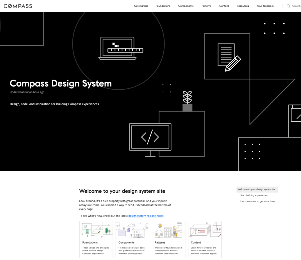

Design systems like the Compass Design System help organizations build consistent, attractive experiences efficiently. These systems pull together design, code, and guidelines for how designers and engineers should use them. The guidelines—the documentation—are one of the places where content designers can lead in a design system.
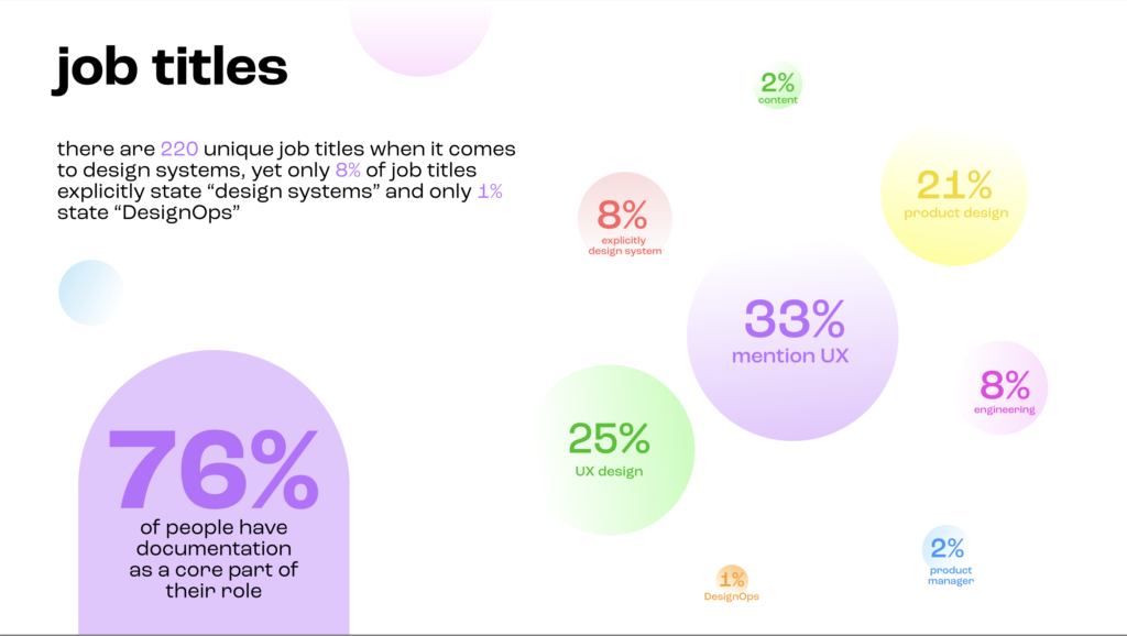
In March 2022, documentation software company Zeroheight published a report on design systems, who creates them, and who uses them. In How We Document, they reported on the job titles of folks working on design systems. Of the 460 people who responded to the survey, only 2 percent have the word content in their title, even though 76 percent of respondents identified documentation as part of their job. (You can see more of this research from Zeroheight.)
Today more content teams identify as content designers. Clearly, content is part of design, and should be part of our design systems.
Usually, it’s not. As I discovered in my research, less than 50 percent of design systems recognize or include content at all.
Let’s look at this year’s research more closely. Yes, I’ll highlight the good news.
Growth in Systems and Content
This year, I reevaluated the 60 publicly available design systems that I surveyed for the 2018 article. (The initial list of 60 came from designer Jad Limcaco’s Design Systems Repo site.) I audited the sites for a number of content elements:
- Was content present at all (as content, content design, UX writing, etc.)?
- Was there an editorial style guide?
- Were there voice and tone guidelines?
- Did real content (not just lorem ipsum) appear in examples, components, and patterns?
- Were there any content patterns (guidelines for content elements we write over and over, like emails, error messages, and empty states)?
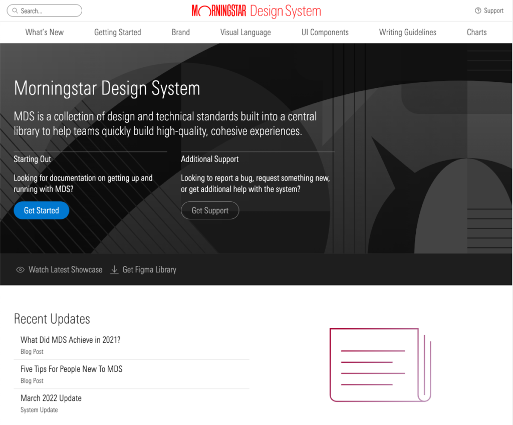
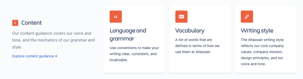
A content-empowered design system would have all five of these content elements, and both Atlassian and Morningstar were bright new additions to the small list of systems that achieved that ideal.
I’m happy to report that I found improvements in all five of the content areas I looked for. Of the 60 systems surveyed:
- 28 include content, usually in navigation (up from 23 in 2018).
- 21 show style guidelines (up from 19).
- 19 feature voice and tone (up from 16).
- 35 display at least some real content examples in patterns and components (up from 31).
- 11 offer guidelines for content patterns (up from 4).
The numbers are improving, and it’s encouraging to see systems like Atlassian, Morningstar, and Shopify’s Polaris continue to showcase content design standards alongside visual and other design guidelines.
Discoveries and Next Steps
In 2018, I called the research report “Content: The Next Big Thing for Design Systems.” If I were truly psychic, I would have identified Figma as the next big thing for systems. Since its launch in 2016, Figma has become the leading design tool for the systems crowd. It’s a vector-based design tool, not a content one, but it does allow designers and content folks to include documentation within the tool itself, right where the design work is happening. Now design systems teams find themselves grappling with content strategy questions of where the documentation should live—in Figma, in a design system site, or in a developers’ documentation site like Storybook.
How about all three? Some initial work has been done on using a headless CMS to store design system content (see articles by content leaders Amy Hupe and Michael Andrews). Then the documentation can be pulled into design and engineering experiences wherever it’s needed. More work needs to happen to prove out this concept, but it’s a fascinating next step in the evolution of design systems—relying on content integrated smoothly into design and development tools instead of a separate documentation site. This is an exciting development and opportunity for content to shine.
In small but steadily increasing numbers, content designers are partnering with design and engineering teammates to build smart, useful systems that support all members of the design and development community. We have a lot to offer.
In a recent presentation at the Information Architecture Conference, I displayed a long, admittedly incomplete list of skills and perspectives content folks can bring to design systems:
- Accessibility
- Communication (release notes, blogs, and more)
- Content-first design (or content-always design)
- Contribution models
- Design documentation
- Design principles
- Governance
- Information architecture
- System adoption
- Taxonomy
- Technical writing
- Workflows
No, we don’t have to do them all. But various aspects at the right time can strengthen our design systems and the people who need to use them. These are topics near and dear to the hearts and minds of our content community. These are areas in which the content community excels.
I look forward to seeing more content talents and insights in our designs and systems. We’re making progress, and there’s more progress to make. Let’s keep going, and maybe I’ll check in to marvel at our achievements in another four years.
The Author

Michael Haggerty-Villa is a senior product design manager at Compass, where he leads a multidisciplinary team creating a unified platform for real estate. He has also worked as a design system manager and principal content designer at Intuit QuickBooks. His design systems and content strategy work encompasses brands such as eBay, Disney, HPE Software, Kaiser Permanente, and Yellowpages.com.
When Michael isn’t staring at various screens, you can find him somewhere in Washington, D.C., driving his children to ballet, soccer, gymnastics, karate, and music classes.
Events, Resources, + More

New Data: Content Ops + AI
Get the latest report from the world's largest study of content operations. Benchmarks, success factors, commentary, + more!

The Ultimate Guide to End-to-End Content
Discover why + how an end-to-end approach is critical in the age of AI with this comprehensive white paper.

The Content Advantage Book
The much-anticipated third edition of the highly rated book by Colleen Jones is available at book retailers worldwide. Learn more!

20 Signs of a Content Problem in a High-Stakes Initiative
Use this white paper to diagnose the problem so you can achieve the right solution faster.
Comments
We invite you to share your perspective in a constructive way. To comment, please sign in or register. Our moderating team will review all comments and may edit them for clarity. Our team also may delete comments that are off-topic or disrespectful. All postings become the property of
Content Science Review.