
One of the buzzy newer job roles in the content field is UX writer. The user experience (UX) writer crafts the words that appear in digital content to help steer users through to accomplish their goals.
Editorial writing informs a reader or entertains. Marketing writing sells a product or service, creating a compelling picture that makes you want to buy it. But UX writing does neither of those things. UX writing succeeds when you haven’t even noticed it.
The biggest secret about UX writing, then, is that the writing itself should vanish.
UX writing serves as an enabler, helping the user accomplish a task, whether it’s viewing a bank balance, booking a doctor’s appointment, or buying groceries. It should guide the user smoothly and intuitively through an experience. Users don’t generally notice buttons or links unless they’re having trouble with them. If UX writing is really effective, the user should be shepherded gently through what they need to do without any kind of friction or stumbling.
What we talk about when we talk about UX writing
What exactly is the difference between UX writing and the other copy on a web page that sells clothing, renews drivers’ licenses or shows pictures of a travel destination? UX writing typically refers to the text in:
- Calls-to-action (buttons)
- Navigation menu items
- Error messages
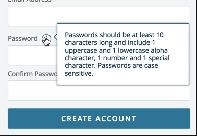
- Tooltips
- Form field copy
- Instructional copy
- Pop-ups and interstitials
UX writing should never call attention to itself. At best, it’s a seamless part of the experience and the user comes away without even realizing they were being guided. They’re not thinking about the instructions they might’ve received, but about the music they just purchased or the weather forecast they just checked.

Here are some more ways you can help users without them even knowing.
Agree to agree
Ensure that stakeholders and other folks responsible for the project are on board with the purpose and style of the UX writing you’re doing and aren’t expecting a dense cloud of verbiage. Make things easy for them to understand by explaining why you are writing the way you are. If you can, offer examples from research about how less copy on the page—but meaningful copy, nonetheless—could result in higher comprehension among users and other KPIs.
Consistency is your friend
Check that your tone is consistent across everything you’re writing. If your audience is young people and you adopt a friendly, casual tone in most of your copy—Hey! What’s up? Let’s get to know each other better—and then your error messages sound like, “We are currently unable to complete the requested task,” it will be jarring to the user.
The same is true of pronouns. If users see “My Account” on one navigation menu but “Your Order History” in another, you couldn’t blame them for being confused. Make a decision on pronouns and stick to it.

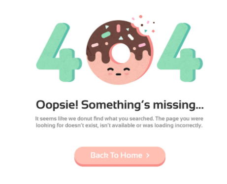
Don’t try to be funny or clever if it’s not consistent with the rest of your content. For instance, showing a 404 page with a baby sitting at a corporate conference room table saying something like “oops, I’m in the wrong place” wouldn’t work unless the rest of the content on your site is goofy and funny. Take note, too, that humor is always a risk in UX writing. What’s funny to you might be offensive to others—or they might not get it.
Get the scoop with research and data
Make friends with your research team. If you can, sit in on user testing. Find out what people think as they navigate through your site, how they feel about the task you’re asking them to do (paying taxes online is going to be a very different experience emotionally from setting up a baby gift registry). If you know what people are struggling with, what their hopes are, their context, it’ll make it much easier to write for them and guide them through the experience.
Keep the language—oops, I mean words—simple
There are more reasons to avoid jargon and multisyllabic words (like the one I just used) than there is space left in this article, but it boils down to several things:
- Accessibility. Some of your users will hear UX copy rather than read it, and at a rapid speed, it’ll be harder to grasp if the words are complex.
- Translation. Your app or site might be translated or localized into multiple languages and plain English will make that task a lot easier.
- Clarity. To make meaning clearer, there’s nothing better than fewer, simpler words. Avoid jargon, those words that may be associated with an industry but that could leave some users in the dark.
- Concision. Keeping it short and simple means fewer words.
Make no mistake in your error messages
Want to offer users clearer, more helpful information when they’ve gone off the happy path and need to get back on? Work with the interaction designers and/or developers if you can, to understand why the application is behaving the way it does. Then you can offer information that won’t confuse users and provides more help than “We’re unable to access your account information. Please try again later.” Even a brief sentence or phrase about what’s going on, an indication about what they should do next, is much more helpful and less frustrating to the users.
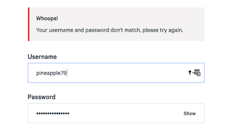
And please, never blame the user. By labeling something as wrong or incorrect, you might make the user feel like they’ve made a mistake, which might lead them to feel frustrated and even abandon what they were doing. Instead, guide them gently and safely back to where they were trying to go.
You’re a writer but also a designer
Whether or not you call yourself a content designer, and that’s a topic for another day, the text you’re writing should inform the design. Work with the interaction designers, UX designers, or whatever the people designing the experience are called at your workplace. You need to know how the interface will perform at any given point in order to write a label for it or a tooltip answering user questions. It should be a give-and-take, with everyone weighing in on what’s going on at any particular point in the journey, so you understand the context and have some sense of what users might be wondering or if there’s any gap not addressed in the content.
Bottom line—be their advocate
The best UX writing works in lockstep with visual and interaction design, to enable that seamless experience we’re all striving to create. You’ll be able to find out through metrics and user testing if your users are successfully completing their tasks, without stumbling over the instructions. Your users might not know it, but they’ve had an advocate working hard on their behalf. And when you get those results, you can keep tweaking and refining the UX copy to ensure it continues to do the best it can to guide the users discreetly and under the radar. It’ll be our little secret.
The Author

Cynthia Gelper is a content strategist, content designer and UX writer based in Chicago. As a consultant, she has worked on user experience teams for a variety of clients and industries including healthcare, higher education, real estate, finance and food.
Events, Resources, + More

New Data: Content Ops + AI
Get the latest report from the world's largest study of content operations. Benchmarks, success factors, commentary, + more!
The Ultimate Guide to End-to-End Content
Discover why + how an end-to-end approach is critical in the age of AI with this comprehensive white paper.
The Content Advantage Book
The much-anticipated third edition of the highly rated book by Colleen Jones is available at book retailers worldwide. Learn more!

20 Signs of a Content Problem in a High-Stakes Initiative
Use this white paper to diagnose the problem so you can achieve the right solution faster.
Comments
We invite you to share your perspective in a constructive way. To comment, please sign in or register. Our moderating team will review all comments and may edit them for clarity. Our team also may delete comments that are off-topic or disrespectful. All postings become the property of
Content Science Review.