As design teams grow and begin creating, launching, and re-creating, they need documentation to guide everyone along to make consistent experiences. Design systems or pattern libraries are often the answer. They pull together rules and recommendations that teams follow as they build new products. But many of these systems exclude content.
Yet content strategy and creation are critical in design. If you want to make a design system your entire team can use, a system that thoughtfully guides the work your team is doing, shouldn’t content be a part of it?
In a quick survey of design systems, I set out to understand how big the content gap is. I also discovered an opportunity for both design systems and the content strategists who can make them better.
The Clothes Have No Emperor: Content is Missing
To check out the current state of content in design systems, I reviewed an initial sample of 60 design systems, mostly from the Design Systems Gallery.
In a similar lineup, design platform company UXPin surveys 76 design systems and pattern libraries. When it comes to content, we have similar findings. The UXPin site shows that about 35% of the systems in their list include voice and tone guidelines. In my sample, about 27% of the sites offer such guidelines. This means that about 30% of these systems include voice and tone. What about the other 70%?
Five Elements of Content in Design Systems
Useful content documentation should encompass more than just voice and tone. In my survey, I looked for the following five elements, key content guidance that helps content designers and others as they create experiences:
- Content: Yes, I’m checking to see if content is present at all. It helps if navigation can get us to areas labeled something like “Copy,” “Microcopy,” or “Writing.”
- Style: Editorial style guides, usage notes, terminology lists, and so forth.
- Voice/Tone: How to write for the brand or product.
- Content in Components and Patterns: Real-life copy in component and pattern examples, not just the commonly-used placeholder text lorem ipsum. Bonus points for including specific content guidelines for the component or pattern.
- Content Patterns or Types: This is how-to guidance for pieces of content that get written over and over again. You know what they are: headlines, error messages, emails, blog posts, contextual help, help articles, and other content types.
The ideal design system would have all five of these content elements. For many systems, just achieving the first three will be ambitious enough.
The Good News: Four Stars
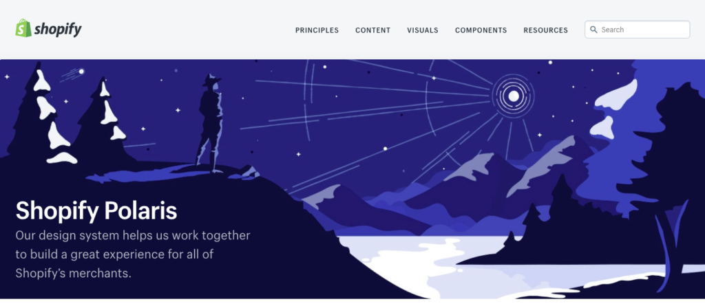
Of the systems I reviewed, four of them have all five elements. The system for Shopify is among the most impressive. Since it went public in 2016, the Shopify Polaris Design System has garnered a lot of attention for its innovation, clean design, and usefulness. A large part of that usefulness is content integrated smoothly throughout the system. Content is featured prominently in navigation, presents clear information for writers, and offers concise guidelines for how copy appears in components.
 The Polaris Design System elevates content to be on par with design at Shopify.

Polaris also smartly separates guidelines for product and help content.

Within components, Shopify designers can find concise guidelines for how content should look and sound.
Opattern, the Opower design system, also features content prominently on its homepage. The site gives writers quick access to information about the Opattern voice, emails, and editorial style.
 The Opattern Design System offers access to content guidelines directly from the homepage.
Because it’s smart, fun, and useful, the MailChimp Content Style Guide is justifiably famous in the design systems and content strategy communities. They’ve even spun their voice and tone guidelines into their own site. It would be helpful if the actual MailChimp Pattern Library referred to these content resources, but this design resource remains separate from the content style guide.
 The open source MailChimp Content Style Guide sets the standard for thorough content guidance.
The QuickBooks Design System is the fourth site that features all five of the elements I checked for. Full disclosure: I work on this site. I don’t want the audit to seem like I’m highlighting things I want to brag about. I genuinely feel these five content elements are valuable for a design system. And, candidly, QuickBooks still has a way to go to provide even more helpful guidelines for the content design community.
 The QuickBooks Design System navigation presents quick access to content guidelines.
The Other News: Where to Grow
Despite these four stars, the survey pointed out that most systems definitely have an opportunity to become even more useful. Of the 60 systems surveyed:
- 23 include content, usually in navigation.
- 19 show style guidelines.
- 16 feature voice and tone.
- 31 display at least some real content examples in patterns and components.
- 4 offer guidelines for content patterns or types.
You might be thinking, “Why are the numbers so low?” Actually, I’m surprised and encouraged that the numbers are so high. Design systems are often side projects of design teams working busily on products and features that directly reach customers. Interaction or user experience designers and engineers are usually the ones leading the effort and needing it the most. Usually, as the system gets larger and more powerful, content, research, and other specialties are brought into the system.
In a recent article, Nathan Curtis, author of Modular Web Design and founder of UX firm @eightshapes, explains how design and engineering are the traditional core of design systems.
“Systems are first made of, by, and for engineers and designers,” he writes in Medium. “While others welcomely contribute and benefit, they are secondary.”
But design systems that serve only design and engineering are not where design systems are headed. In that same article, Curtis explains that:
“[T]he arc of design systems bends towards collaboration across disciplines not limited to designers and engineers. If you intend to scale, advocate for content that serves a widening audience.”
Content strategists are part of that widening audience. And content professionals can help systems reach that broader design community as they work to create more uniform and meaningful experiences.
Next Steps: Action Items
Admittedly, this is preliminary research. I still want to review all 219 of the design systems on Website Style Guide Resources. That’s my immediate action item.
But that site lists only public systems. I’d love to have a peek at some of the style resources tucked away in secure intranets. Furthermore, some sites were not operational during my survey. The Autodesk Human Interface Guidelines were not yet public, but what I glimpsed briefly looked inspiring and smart.
My early hypothesis, that content has been deliberately kept out of design systems, is only partly true. That’s encouraging news, and it reflects the evolution of design systems. They’re becoming larger, more thoughtful, and inclusive of more of the design community. Content professionals can help these systems grow, and along the way, we can benefit from our expanding collective design wisdom. That’s an action item for all of us.
Events, Resources, + More
The Ultimate Guide to End-to-End Content
Discover why + how an end-to-end approach is critical in the age of AI with this comprehensive white paper.
The Content Advantage Book
The much-anticipated third edition of the highly rated book by Colleen Jones is available at book retailers worldwide. Learn more!
20 Signs of a Content Problem in a High-Stakes Initiative
Use this white paper to diagnose the problem so you can achieve the right solution faster.
Upskill with Content Science Academy
Training for modern content roles through on-demand certifications + courses or live workshops.


Comments
We invite you to share your perspective in a constructive way. To comment, please sign in or register. Our moderating team will review all comments and may edit them for clarity. Our team also may delete comments that are off-topic or disrespectful. All postings become the property of
Content Science Review.