
How do you know if your content is working?
The question is simple—but the answer can be complex.
Enter ContentWRX. This content effectiveness evaluation tool captures content-focused feedback and analytics from your real users. This data is available in an easy-to-use interface, giving you actionable insight into your content’s effectiveness.
In a previous article, we covered how to use ContentWRX to create a benchmark for your content effectiveness. Having this benchmark in place is great for identifying your opportunities to improve content effectiveness, but once you start implementing those changes, how do you know if they’re working? In this article, we’ll cover several ways you can leverage the data and insights provided by ContentWRX to track the impact of these changes. Let’s begin by talking about how ContentWRX helps you pinpoint the areas of your content most in need of change.
Six Dimensions: Understanding Where There’s Room to Grow
ContentWRX uses a blend of Voice of Customer and behavioral data to get a better overall sense of how people both perceive and use your content. The tool makes it easy to collect real feedback from users. ContentWRX then provides personalized recommendations across six dimensions of content effectiveness:
- Discovery: How do users discover your content? Do users find the content they need?
- Accuracy: Do they perceive the content as accurate?
- Polish: Do users perceive the formatting and design of the content as high quality?
- Relevance: Do they perceive the content as serving their needs or interests?
- Usefulness: Does the content anticipate users’ needs and enable them to complete the goals?
- Influence: Do users take action or make a decision after viewing the content?
ContentWRX evaluates your content’s performance across these six dimensions to measure the areas where your content is hitting the mark. The software provides a quick, visual representation of the effectiveness of your content within the Overview screen, shown below.

A green check will tell you that your content is effective within that dimension—but anything less will alert you as to where your content effectiveness can improve. Clicking on the button labeled “Recommendations” provides a rundown of your content’s success and weaknesses, along with specific recommendations for improving content effectiveness.
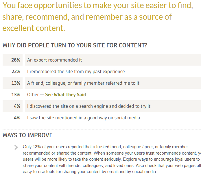
You can use these recommendations to identify specific content strategies for your new content—or even to drive the changes you make to existing content.
To understand which pieces of content are contributing to these perceptions, click on the Breakdown tab. Under the “Page/Screen” breakdown, you’ll see a breakdown of individual pieces that look something like this:
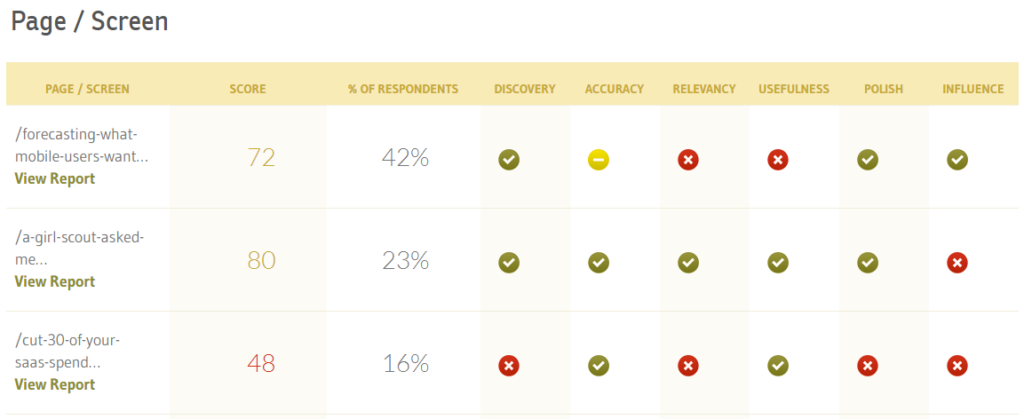
Rather than a high-level view of your overall content effectiveness, ContentWRX points specifically to individual piece performance, such as:
- The overall perception of the content by users who viewed your most popular content
- Indicators of how this content affects the perception of dimensions like Relevancy and Usefulness
This will give you a better sense of which pieces are helping you meet your goals and which pieces aren’t resonating with your audience.
Now that you have a clear idea of where you can improve the impact of your content, how can ContentWRX help you understand whether or not your changes are making an impact? We’re glad you asked.
Using ContentWRX to Measure Content Changes to Your Content
ContentWRX provides several opportunities to compare your content’s performance to the previous months’ data.
Within the Overview tab, you can look back at a previous month’s results using the “Collections:” drop-down. This can be helpful if you want to look up details about your content performance over the past several months, or even last year.
If you need to track the impact of changes in your content’s performance over a long period of time, another place you might look is the Trends tab.
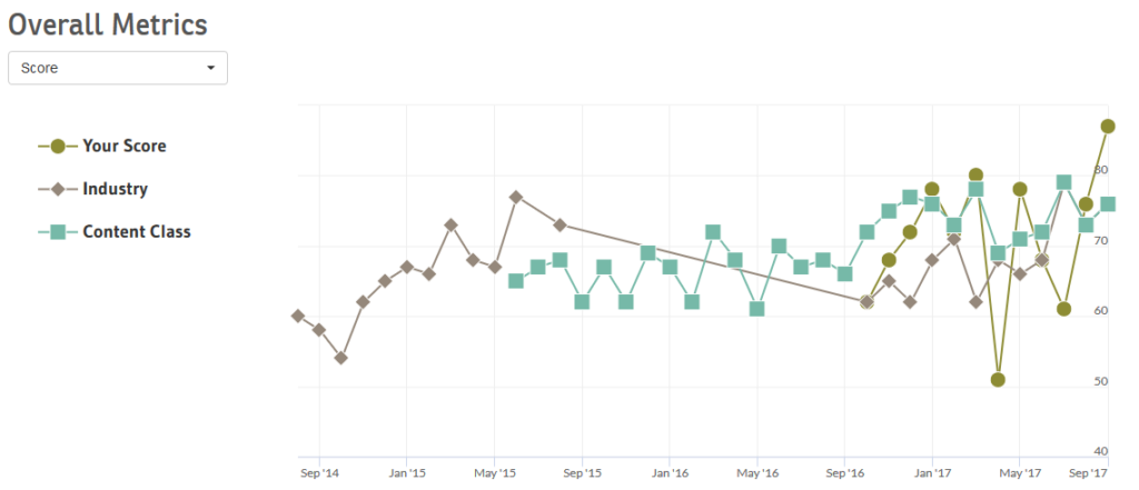
This screen provides a visual representation of how your content performs over time, including:
- Overall content effectiveness, represented by the ContentWRX score
- Engagement rates, such as pages viewed per session or time on site
You can also track how your content is performing across these metrics relative to your Industry and Content Class. The Device Type chart allows you track these same metrics across device types to evaluate and track the impact of changes to your content for desktop, mobile, and tablet experiences.
On the Breakdown tab, clicking between the current month and Last Month allows you to gauge differences in content performance month-over-month and how any changes you’ve made to your content impacts this. The individual elements of this tab are:
- Devices: Is the design and responsiveness of your content effective? Are there specific screen sizes in which your design might be an issue?
- Demographics: Do you want to emphasize a single persona? Are you missing out on a specific audience segment
- Page/Screen: If you want to emphasize changes in the individual pieces of your-already popular content, use Page/Screen to get a sense of how that content is affecting content perception.
Consider an example: let’s say your business offers data solutions for companies of all sizes. You’re using ContentWRX to understand how effective buyers from different-sized companies perceive your thought leadership content, and notice that users from Enterprise-level organizations lag behind other companies:
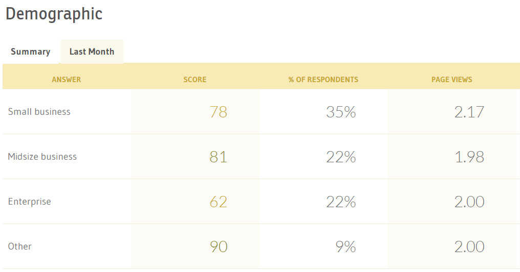
You want to understand why this happening, so we need to understand what’s driving poor content experiences. To do this, use the Sentiment tab.
The Sentiment tab shows you a breakdown of the sentiment behind user responses and creates word clouds that show common themes present in your user feedback. These word clouds show you both what you’re doing right, as well as potential areas for growth. You can identify why people think your thought leadership content isn’t up to snuff using the word cloud, seeing something like this:
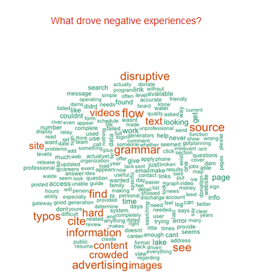
Now you can quickly identify what needs to be addressed – grammar and typos, disruptive advertising, and citing your information – and measure the impact of addressing those drivers.
As you make changes to this content, you can keep an eye on the overall volume of positive/negative mentions and use the Last Month tab to see if your content changes are having an effect.

Now you’ve addressed these items, and maybe even created some new content that addresses Enterprise-level data questions. You’ve published this content on your site and promoted it through your marketing channels, but how do you know if it’s helping your users view your organization as a trusted expert? The simplest way is via the “Last Month” tab, available within your Demographic breakdown.
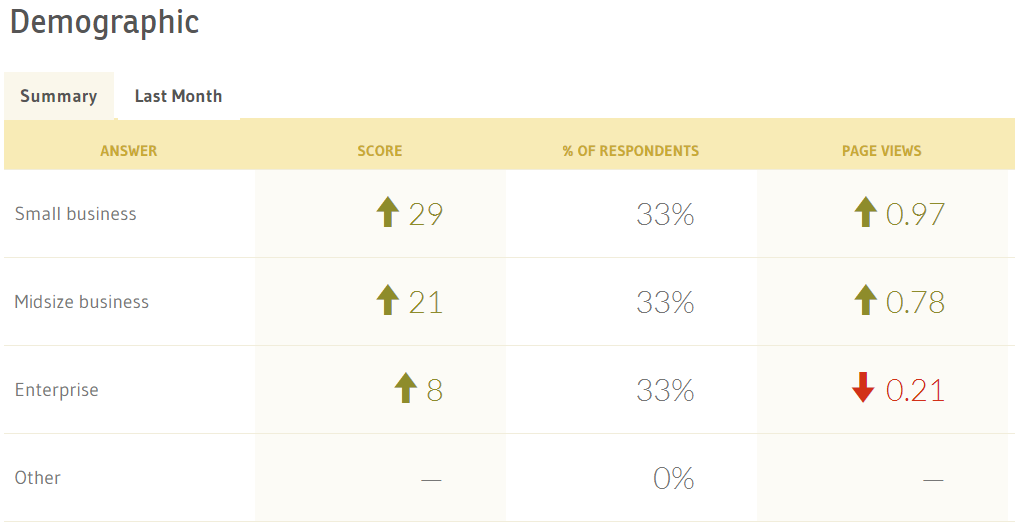
Here we can see that the average ContentWRX score for Enterprise-level users has increased by 8 points from the previous month, signaling improved perceptions of content effectiveness.
But why did this happen? ContentWRX can also help you understand what’s driving perceptions of your content experience using sentiment analysis.
Measuring your performance against previous months will give you real data about the effectiveness of your content and whether or not your changes are having any effect on the audience. ContentWRX gives you the power to demonstrate concrete improvements in user sentiment, perceptions of effectiveness, and engagement when presenting your results to executives and other team members.
Using ContentWRX, you’ll have a much better chance of visualizing, strategizing, and understanding the evolution of your content over time. Not only will you have access to real data from real users, but you’ll be able to better track your content’s effectiveness in individual areas. The key? Stick with it. Over time, the impact of your content will improve as you discover what works for your audience.
Events, Resources, + More
New Data: Content Ops + AI
Get the latest report from the world's largest study of content operations. Benchmarks, success factors, commentary, + more!
The Ultimate Guide to End-to-End Content
Discover why + how an end-to-end approach is critical in the age of AI with this comprehensive white paper.
The Content Advantage Book
The much-anticipated third edition of the highly rated book by Colleen Jones is available at book retailers worldwide. Learn more!
20 Signs of a Content Problem in a High-Stakes Initiative
Use this white paper to diagnose the problem so you can achieve the right solution faster.





Comments
We invite you to share your perspective in a constructive way. To comment, please sign in or register. Our moderating team will review all comments and may edit them for clarity. Our team also may delete comments that are off-topic or disrespectful. All postings become the property of
Content Science Review.