
We crossed paths with Dona Wong, author, digital strategist, and former graphics director, at the Analytics with Purpose conference in Arizona and knew immediately we wanted to share her expertise and insights about data visualization with our CSR audience. Since IBM reports that “80% of all data today is unstructured. This includes news articles, research reports, social media posts and enterprise system data,” gaining insights into how to better utilize data is paramount to moving the content industry forward. Read on to learn from a 23-year content veteran.
Can you give us a quick synopsis of the trajectory of your career?
I had the opportunity to study under the tutelage of Edward Tufte at Yale University, a pioneer in data visualization. I’ve learned that data visualization is a powerful, persuasive tool to discern unexpected patterns and anomalies.
My first job out of design school was at Deloitte & Touche. Working in their international tax practice at the national office, I was immersed in financial statements and economic analysis — I practically earned an MBA! That experience helped jump-start a career in business graphics at The New York Times. In 2001, I was recruited by The Wall Street Journal to join the design team for a historical transformation at the paper — the introduction of color in 2002. As the head of graphics, I set the standard for all feature and breaking news graphics for the flagship paper, The Wall Street Journal, and its affiliates, including wsj.com.
After almost two decades in visual journalism, I compiled my experience in the book The Wall Street Journal Guide to Information Graphics. To expand my portfolio, I then joined the brand agency Siegel+Gale to advise Fortune 500 clients and major government institutions on strategic communications. As digital communications and data visualization gained more influence, I had the opportunity to join the Federal Reserve Bank of New York to build the digital strategy team.
You recently contributed an article for Applied Marketing Analytics about telling compelling stories with data. Can you share an example of one compelling story that data has told you?
[Editor’s Note: Content Science CEO Colleen Jones is featured in the same issue.]Under the guidance of my thesis adviser Edward Tufte at Yale University, I completed a two-part thesis — the first on optimizing the display on the patient’s monitor in the hospital’s intensive care unit; the second part on mapping the location of emergency phones in relation to crime statistics on campus. In the latter example, the juxtaposition of the two data sets — emergency phone locations and crime statistics — has created a whole new meaning that was not there before. We can now answer the question: Are emergency phones available at high crime locations?
Data visualization is not eye candy; rather, it is a tool that turns data into actionable insights. Already in my early studies, I learned that information graphics can be literally a matter of life or death.
How about a bad example of data visualization you’ve seen recently?
In the current state of data visualization, most graphics out there are merely data dumps. There are 3D lines, 3D bar charts, pie charts with 10 slices … the list is endless. They are enabled by easy access to software. Over time, people will become more educated and more demanding as consumers of graphics. They will ask the basic question: Does the graphic help me make informed decisions? They will not appreciate charts that mask the information.
Do you have three tips you can share about how to tell stories with data?
Here is a diagram that illustrates the general principles for producing impactful graphics.
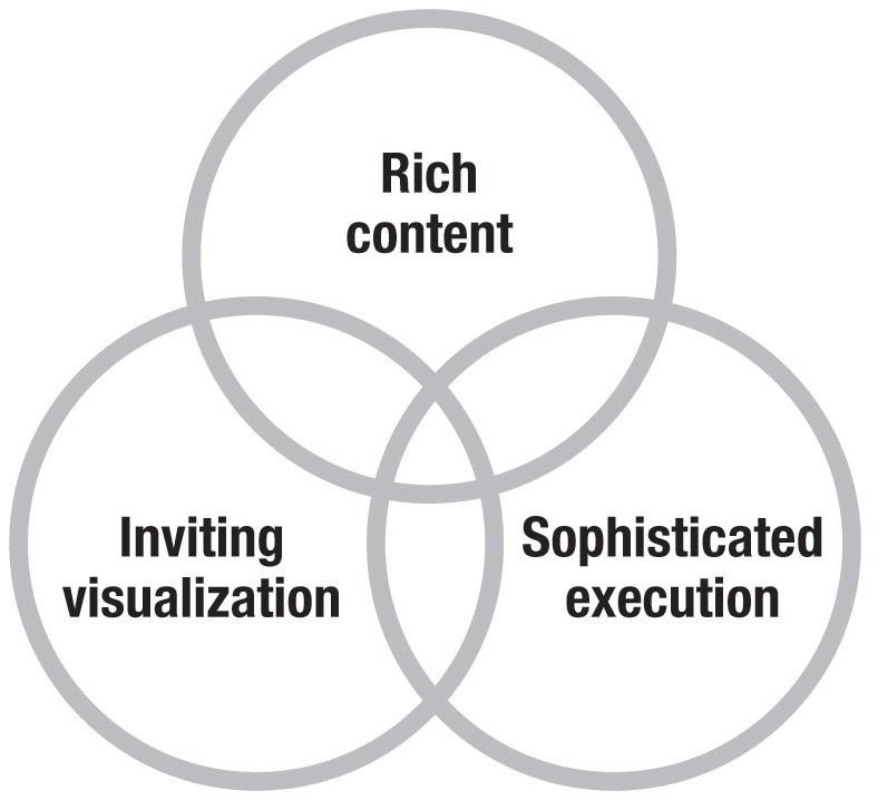
Illustration from The Wall Street Journal Guide to Information Graphics
In any story, content comes first. The three essential elements of good information graphics are:
- Rich content brings meaning to a graphic.
- Inviting visualization interprets the content and highlights the essence of the information for the reader.
- Sophisticated execution brings the content and the graphics to life.
Many companies sit on a huge volume of unstructured data. What’s your advice to brands that want to leverage this data?
Data is the new oil — plentiful, but unrefined. Data is meaningless unless it is filtered, analyzed and presented in a way that is easily understood by the targeted audience. Data strategy is about finding the story. It requires analyzing the data and choosing the right chart form to turn volumes of data into intelligent graphics to provide actionable insights.
Everyone talks about big data. Rather, the real story is in the small data. We are inundated with massive amounts of information every second of the day. As information designers, we have to organize, analyze, and distill the big data into small data, that is, into digestible blocks, and turn it into actionable insights. For instance, every time we swipe our credit card, we are giving out valuable information to our marketers – our location, our demographics, and our spending habits. However, spending data is only useful when it provides insights for the marketers to tailor their ad campaign. That’s what makes it “actionable.”
What data visualization and/or information graphics trends do you see emerging? What do you think data visualization will look like in five years?
We need to go back to basics. Data visualization is a means to an end, and not an end in itself. The question we need to ask is how do we actually use data visualization to present the data in a way that provides insights to our audience to meet any organizational or business challenges. There’s nothing wrong with producing an inviting graphic to help sell an idea or a product, but the visualization has to be supported by facts with accuracy and clarity. My philosophy of data visualization is straightforward: Know the content, distill the information, and put my audience first.
What’s one actionable piece of advice from your book, The Wall Street Journal Guide to Information Graphics?
All great data visualizations start with identifying a clear message and developing the data strategy. Data strategy is about evaluating the data to select the right chart form and the right color to display the information clearly. Selecting a chart form is not like choosing a T-shirt. Every chart form has its own function. In my workshop, we use the same data to try to tell different stories. Depending on the data analysis and the chart form, you are either telling a story about market share or growth.
In data visualization, color is much more than branding or personal preference. Color is used to differentiate the hierarchy of information. Everyone can perceive the difference in shading, but they may not differentiate certain colors. As I share in my book: “Color combinations such as red/green or blue/yellow … can be similar in value or lightness. The lack of contrast in lightness makes it virtually unreadable for colorblind users.” And yet, we see these faulty color combinations all the time in graphics.
What are two elements that should be considered in a digital content vision?
The most important element in a digital content vision is relevancy. We are inundated with data or content, be it qualitative or quantitative. Our content needs to be mapped to a clear objective with a targeted audience. It starts with storytelling and ends with actionable insights. The question is not “How much content?” Rather, we want to answer “How useful is the information?” We would then be able to distill the data and put it on the proper channel and platforms to reach our audience.
From my days as graphics editor at The New York Times and head of graphics at The Wall Street Journal, I learned the audience is the most important group of people in my work. Having millions of readers means having millions of critics on a daily basis. Understanding my audience helps shape my graphic. For example, a lab report with clear illustrated graphics about blood pressure and cholesterol level can motivate patients to exercise more and change their diet. However, if the graphics are overly complicated, the report is not only useless, it is a disservice to the patients. We have to take the perspective of our audiences and approach the solution with conviction and empathy, as well as accuracy.
The views expressed here are Wong’s own and do not necessarily represent those of the Federal Reserve Bank of New York.




Comments
Comments are closed.
We invite you to share your perspective in a constructive way. To comment, please sign in or register. Our moderating team will review all comments and may edit them for clarity. Our team also may delete comments that are off-topic or disrespectful. All postings become the property of
Content Science Review.