
We as content strategists have a problem. We feel like we’re making progress by plowing through our spreadsheets that list content, thinking that’s solid content inventory analysis. We may even impress our teams with these spreadsheets. But we’re not being effective.
Gathering insights with a visual content inventory
We need insights—like:
- What are the patterns of our current content?
- What coherent decisions are we making about the content?
- What rules can we apply to operationally improve our website on an ongoing basis?
Probably the most common time to do a content inventory is before a big digital transformation. This is our opportunity to make the highest content impact, both on the transformation itself and on an ongoing basis (by setting up the right structures).
But we’re not going to get there with spreadsheets alone. We need artefacts like graphs that we can share and discuss broadly (including at the executive level) and iteratively (we need to tweak and explore as we continue to understand our content).
Example 1: Visual overview for executive decision-making and buy-in
The highest impact changes often require the highest level buy in. For instance, perhaps you need the executive team to agree to tear down digital silos. A spreadsheet will not impress them. They may be interested in talking about competitors, but this can devolve into looking at a bunch of example pages rather than tackling wide issues like digital silos. So we need to present the overall pattern of the digital presence to engage with them.
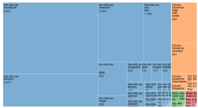

Caption: Example treemap of several websites of a university (from Content Chimera)
The above is a treemap (treemaps were invented by a college advisor of mine, Ben Shneiderman), which is a means of displaying hierarchical information in a dense manner. In this example, each color represents a site in the digital ecosystem, and the blocks are the sections within each site. The size here is drawn from the number of URLs.
Note that the example above shows multiple sites in one chart. I recently used this type of chart in an executive decision-making workshop where the CEO and others decided on a more standardized approach to their sites around the world. Of course there was more than a treemap involved, but this was a chart that the team could immediately engage with. For instance, the organization had websites representing various real-world, on-the-ground projects around the globe. I was able to quickly point out that some websites had a large digital footprint even though the real-world project was long over.
Example 2: Quick-hit view of the patterns of a site
Sometimes we need to glean a quick initial understanding of a website or collection of sites. For instance, we may need to quickly get to grips with what a new or potential client’s web presence is like, especially if you will play a role in changing the content. Or you may want to answer a quick question about the content on your own site.
Many sites are organized logically by their URL patterns, for instance the “folders” in a URL—here is an example of quickly charting a city government site by how many URLs are in each folder (like https://testcity.gov/uploadedFiles/test.pdf in “uploadedFiles”):
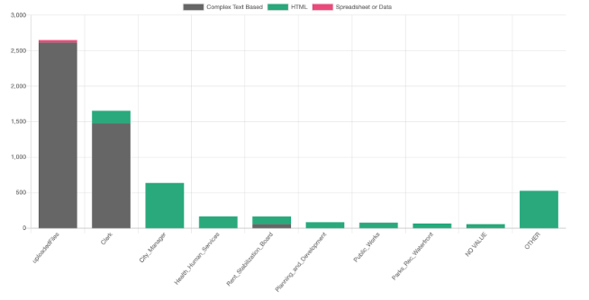
Caption: Distribution of the number of URLs per folder, colored by the file type (from Content Chimera)
In this chart we’re looking not only at the number of URLs in each folder, but the breakdown by type: Complex Text Based (like a PDF or Word doc), HTML, or Spreadsheet or Data (like an Excel sheet).
Graphing the first folder is usually a good way of quickly getting a feel for a site (it’s always how I start). As we dig in further we may have other questions. For example, it may be useful to see the distribution of page counts in the PDFs if you have a lot of them to deal with. Here, the height of the bars is the number of PDFs that contain that many pages—for instance, the leftmost bar represents that there are over 1,500 PDFs that have up to 20 pages.
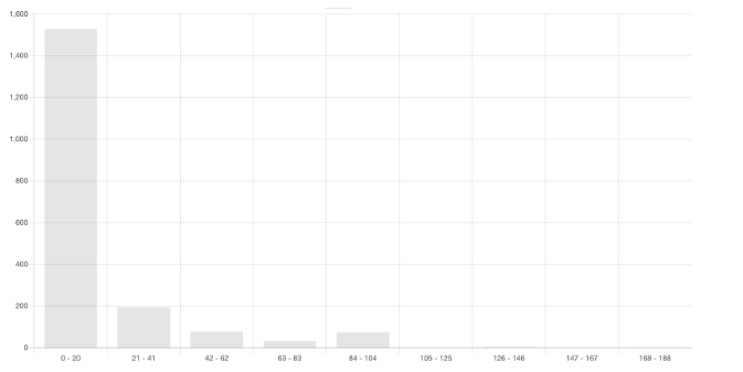
Caption: distribution of page counts in PDFs (from Content Chimera)
Example 3: High level view of content decisions
The above two examples should be done very early in transformation planning. But you also want insights later in the planning process as well, such as a summary of the content decisions that you have made to date (or to communicate them broadly when they are final).
There are three primary decisions that need to be made about content:
- bucket (what the content is, like “old blog post”)
- disposition (what you’re going to do with it)
- resourcing (who’s going to do it)
You can display this at a top level like this:
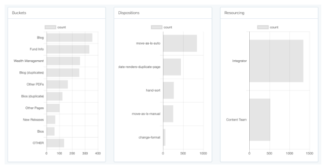
Caption: Example showing content decisions: by bucket, disposition, and resourcing (from Content Chimera)
Get charting for insights!
How do we get to insights rather than spreadsheets? We need three things:
- The source(s) of information
- Manipulating the information to be useful
- Charting
If content analysis hinges on extracting themes and meaning out of unstructured information (as stated in the landmark book Universal Methods of Design, which includes several examples of visual content analysis and insights) then software is often the enabler that drives it.
The usual source of information is a spider (like Screaming Frog). Some of the advantages of a spider are:
a) you don’t need access to any backend systems
b) you can (largely) set-it-and-forget-it while it crawls
c) it provides the data in a consistent manner (including across multiple sites)
Other sources would be databases such as the content management system itself or Google Analytics.
The usual way of manipulating the information (such as pulling out the folders from the URL and determining the overall file type) is in Excel, although this is error prone (and I got tired of copying and pasting formulas) so I have stopped using this approach. A better approach is to use an ETL (Extract-Transform-Load) tool like EasyMorph, where you can be more methodical about these types of changes. The graphing tools below can also do some of this manipulation of the content to be useful for charting.
The biggest win is probably simply charting the data you have now, such as from spidering. You can do some charting in Excel, but I recommend moving to a higher power tool that is dedicated to charting. Example charting tools are Zoho Analytics and Microsoft Power BI. An advantage of these types of tools is much more charting flexibility, the ability to drill down into the data represented in the chart, and some built-in ability to merge data sources.
Another option is Content Chimera, an all-in-one tool (gathering, transforming, and charting information) from my company David Hobbs Consulting that is optimized for content analysis.
Step away from the spreadsheet and toward visuals for better content insights
Long lists of content are of limited value on their own. To get better insights, use charting to better understand your content, involve more stakeholders, and make decisions. These visuals are useful both when exploring your content as well as formal artefacts after decisions are made. Get charting!
The Author

David Hobbs helps organizations make higher impact digital changes, especially through very early strategy. David also works to distill complex situations, especially with visuals, to ensure broader understanding and buy-in.
What to Check Out Next
Events, Resources, + More

Workshop: Are You Ready for AI?
Is your organization really ready for AI at scale? Let the Content Science team guide your leaders through assessing 4 areas of readiness.

Course: Prompting Text Generative AI
Learn how to bring out the full potential of text generative AI to create impactful content from this on-demand course.

Webinar: Benchmarks for Content Effectiveness
It's not about more content. It's about more effective content. Gain tips based on Content Science's unique research + experience.
The Ultimate Guide to End-to-End Content
Discover why + how an end-to-end approach is critical in the age of AI with this comprehensive white paper.
Comments
We invite you to share your perspective in a constructive way. To comment, please sign in or register. Our moderating team will review all comments and may edit them for clarity. Our team also may delete comments that are off-topic or disrespectful. All postings become the property of
Content Science Review.