
How do you plan what to do tonight, or this weekend? Whether you’re deciding what to wear, commuting to work, or planning a picnic, checking the weather is a fairly universal step in daily planning. The forecast can influence how you plan and what you do. At The Weather Channel, the well-known consumer brand from The Weather Company, an IBM Business, we understand weather can be personal, and we strive to deliver that information in a relevant, tailored way.
We were already doing a great job of messaging users during severe weather events; that was our Super Bowl. But we know that users may have typical, non-severe weather at least 60% of the time or more, whether that is a week of sunny days in California or a month of generally rainy weather in the U.K. We were missing out on that opportunity. So our consumer product group was challenged last year with expanding our brand experience across all weather and all locations.
We coined this the “Sunny Day” strategy, and every team, from product to marketing to editorial, jumped onboard.
A leading test bed for our “Sunny Day” efforts was our home screen content strategy. As the entry point for mobile users to our app, we strive to provide an outstanding home screen experience and surface the most relevant, interesting content for them at that moment. I’ll show how this evolution of home screen messaging balanced three elements:
- User context, specifically whether a user’s location had typical (e.g., everyday/normal), active (e.g., raining), or severe (e.g., life-endangering) weather now and in the near future.
- Business differentiators, including radar, video, alerts, and other smart insights.
- Sponsored features, such as dedicated severe landing pages sponsored by advertisers, or lifestyle products, like an allergy tracker that notifies users when pollen is high.
Now, we’ll share lessons learned along the way.
Lesson #1: Analyze the Science (Data) to Inform the Art (Storytelling)
To decide which weather stories we wanted to prioritize to users, we dug into the analytics. We analyzed the app events that trended higher during different types of weather locally, regionally, and globally, using a longitudinal study of select domestic and international markets. For example, when there was a severe snow storm approaching in the U.S., we saw users increase their daily forecast interaction up to five days in advance. Video viewing also skyrocketed. Surprisingly, international users would also tune in to watch the storm coverage, before, during, and after the event. When it was raining, radar activity spiked. When there was typical weather, almost all activity leveled off.
From there, we sketched the stories that were most compelling across more than 20 different weather scenarios, from a life-threatening storm to beautiful weather outside. Then we started building business rules that allowed each of these weather data points to surface in the right order from our API. For example:
No severe weather alert currently active in a location? Business rules would then check to see if there is rain in the forecast in the next five hours. Yes? Display radar.
Lesson #2: Tell People What They Need to Know for Everyday Life
One tricky hurdle was taking the structured weather data (contained within an API) and turning it into natural sounding language. We wanted to ensure the insights were simple and easily understood by any user, not just our weather scientists!
We worked closely with our backend team to create a robust implementation. In fact, there are more than 150 possible stories that can render on the home screen for the best possible experience.
To help visualize lessons 1 and 2, I’ll take the example of a rainy home screen scenario (see picture below). In addition to wanting to know about when it will rain, we find users want to know when rain will stop so that they can maximize their day. We also share something they can do when the rain clears (e.g., view the Perseid Meteor Shower, the most active shower of the year).

The multitude of scenarios are not only based on time of day, location, and current conditions, but also on available app features or sponsored sections. The home screen directs users to radar during rain, an allergy forecast during high pollen days, or a GoRun forecast to help runners know when it’s a good time for a jog.
Lesson #3: Use Testing to Jump-Start Performance and Align Stakeholders
We tested into the strategy with robust A/B tests. We tried everything from providing the most basic data points (such as a quick link to the hourly forecast) to robust and variable insights (such as the 48-hour expected snowfall). Both the product team and leadership embraced innovation and even included a few “sacred cows” in the testing framework. When we see numbers like “70% increase internationally in four months,” others can’t help but get onboard!
Lesson #4: Drive Habit Formation with a Balance of Consistency and Variability
We also re-imagined the content structure and design. Here, the details really count. When we assigned concise, destination labels to our call to action buttons, users clicked more often. In the same image shown above, for example, when we paired a text insight statement (such as “rain starting at 6:15 p.m.”) with a table showing the corresponding data (such as the next five hours), click-through rates also increased.
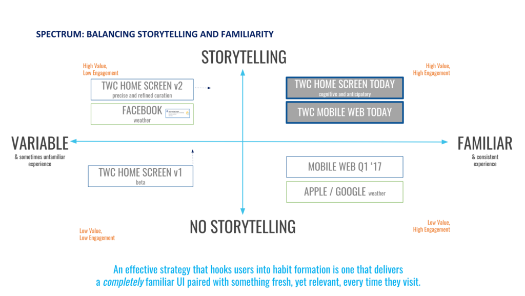
Also, as we increased customization of the insights we were presenting to users, we created a new business problem to solve. That is, while users were receiving increasingly variable experiences especially customized to their circumstances, we needed to ensure other elements — such as the design grid and the way data was presented — were more consistent to offset the balance. We sought to increase our consistency of the experience without sacrificing storytelling. We decided to always anchor a larger table with a smaller text-only statement, for example. Increasingly familiar experiences are balanced with more storytelling, but newer, more variable experiences pair with less narrative (this strategy is shown below).
What’s Next?
Immediately, our “Sunny Day” efforts started seeing results. Since launching, we increased performance in double digits across all priority metrics, including visits per user, sponsorship traffic, total impressions, and retention. This is particularly significant in an app world where every percentage point counts. International engagement, a key factor in global relevance and expansion, skyrocketed. A priority metric for content strategy, click-through rate, went up 23% in less than three months.
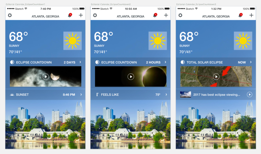
International scale, personalization, and cognitive enhancements are our highest priorities for future exploration. We’re exploring behavioral (e.g., lifestyle and video) customization. We’re rolling out internationally-driven insights like precipitation intensity for our users in East Asia who are plagued by planning for monsoon season. We’re delighting users during weather holidays, such as the solar eclipse countdown (shown above), with live video. To enlighten the experience, we’re discovering the power of Watson, IBM’s powerful cognitive technology, to help answer users’ trickiest weather questions.
Whatever a user’s location, device, or weather conditions, we’ll continue to optimize the home screen experience to make it easier for them to find what they’re looking for and help them make better decisions based on the weather.
Finally, I’d love to hear about your marketing ideas, inspirations, and insights. Are you creating habit formation for your users? Are you collating stories? Are you using analytics to drive your approach? Please reach out to me at @GeekLindsay on Twitter.



Comments
Lindsay, Amanda, thanks for this tremendous post on CX. I love the way how you setup the CX co-relation with Brand Experience.
PS: I immediately recall that Chris Spears wrote a related post in the same CSR space, two months back. Reference: https://review.content-science.com/2017/06/customer-experience-as-we-know-it-isnt-working-now-what/
Thanks for checking it out, Vinish. Chris Spears’ point about how a brand must be evaluated across experience and context resonates with us at The Weather Channel. Location is a context that changes a user’s experience every day, and it’s tricky to manage that brand experience as you scale globally, for example. What are your brand experience and CX interests?
-Lindsay
Comments are closed.
We invite you to share your perspective in a constructive way. To comment, please sign in or register. Our moderating team will review all comments and may edit them for clarity. Our team also may delete comments that are off-topic or disrespectful. All postings become the property of
Content Science Review.