
In today’s mobile-first, digital world where less is more, short and precise content is critical to achieving and maintaining user engagement. But if we’re not careful when writing task-oriented copy, it can quickly become stiff and robotic (read: boring).
As UX copywriters, one of our biggest challenges is striking the right balance between helping the user along a specified path while simultaneously representing the brand’s personality. How can we bring life to copy for task-based user experiences? How do we keep the user focused on completing a task without sacrificing friendliness and, well, fun?
It’s not an easy thing to do, and there’s no secret formula to make every sentence shine, but my team and I at Cricket Wireless have found that even the smallest changes can make a big difference in the experience. Feedback from user testing typically confirms this hypothesis.
There are several brands that I admire who are doing a fantastic job at expressing their personalities, even in the most ordinary scenarios. We’ll get to the examples in a minute, but first, let’s ground ourselves in some definitions. Then we’ll dive into why brand voice is so important in UX copywriting.
What is UX copywriting?
User experience copywriters create copy for interactions, field labels and help tips, button copy, CTAs (calls to action), confirmation messages, status messages, error messages, and all the little pieces of informative or instructional copy (also known as microcopy) that help a user complete a task or flow.
Putting it simply, UX copy should integrate seamlessly with interface and design elements, enabling a user’s success. Effective UX copy enhances an interaction by providing clear instructions and making the path forward easier to follow. Bonus points for calling attention to how easy the interactions are. Effective UX copywriters also anticipate the user’s needs and strategically place answers to questions the user may have along the way.
It’s important to note that copy itself should be considered during the design process. It’s a graphical element that needs to be balanced with the images, icons, tiles, fields, and buttons. Placement of copy has a huge impact on its success. Breaking up copy into small chunks with unique visual treatments can encourage users to read more than just the headings on the page.
It’s critical that UX copywriters work closely with experience architects and interaction designers to agree on solutions that allow copy to succeed.
The UX Rule
A general rule of interface design is that everything on the page should have a purpose or a function. We can apply this to copy and say that every word on the page should have a purpose or function, which may be to inform or educate, to enable interaction or navigation, or to guide or encourage behavior.
But we want to be direct and to the point. In general, we try to avoid unnecessary words or fluff, yet we need a little bit of finesse so our copy doesn’t end up sounding mechanical or feeling clunky. If writing is our dance, we want it to be graceful.
Especially when designing for mobile screens, we should carefully select each word we use, ensuring we use as few words as possible to get the user from point A to point B. Brevity is the shortest distance to the next click.
A digital content style guide is usually a good place to start. At Cricket Wireless, our guide includes a list of common phrases that can easily be shortened. For example, instead of saying ‘in the event that,’ say ‘if.’ Instead of saying ‘in order to proceed, select’ simply say ‘select.’ Swap out ‘at the moment’ for ‘now.’ And replace ‘during the time that’ with ‘when.’
So now we’ve got precise, straightforward copy, but how does it feel? Is it alive? We can’t ignore opportunities to insert personality into an otherwise mundane piece of text. Which brings me to my next point: Copy can both enable interaction and bring a brand’s voice to life.
Why is brand voice important in UX copy?
- It creates a consistent customer experience. So customers have a sense of who you are as a brand, it’s important to provide a holistic user experience from start to finish. The goal is for customers to hear the same voice in every interaction they have with your brand, from the awareness stage to purchasing to retention.
Most of the time, a customer’s first taste of a brand’s personality comes in the form of marketing content. They may see a digital ad or watch a TV commercial. So when they come to your website or app to interact, that same personality should carry all the way through the purchasing flow and into the account management functions.
That doesn’t mean tone can’t change—it may vary based on the interaction or scenario—but personality remains the same. Users get to know your brand personality and then they know what to expect, creating a sense of trust and friendship with your brand. If a user enjoys your brand personality, they’ll likely interact with you again. Which brings me to my next point… - It increases engagement–which hopefully leads to increased conversions. Users generally want easy and fast solutions to moving through digital experiences. Without that, voice alone can’t keep your users on task. UX copy must first guide the user simply through the interaction. We can think of personality as the icing on the copy cake.
Have you ever been shopping online and encountered text or images that made you smile (or better yet, laugh) along the way? When that happens, it’s truly one of those “surprise and delight” moments, and you leave with a good feeling about the brand. You’re more likely to return to the site or app and you might even tell your friends about it, thus increasing brand engagement. Keep in mind that even if you can’t make your users LOL, if you’re bored with your writing, your user will probably be bored with it, too. Even the smallest bit of fun can make a difference.
- It allows your brand to connect with users. Another reason why it’s crucial to make task-oriented copy feel alive is because this digital experience may be the customer’s only interaction with the brand. In the case of a retail store, customers interact with a real-life, in-person sales rep who has a genuine personality. Hopefully, that rep has a good personality and knows how to incorporate the brand voice into their spiel, but either way, a real person has an advantage when it comes to influencing consumer choices.
- It creates a consistent customer experience. So customers have a sense of who you are as a brand, it’s important to provide a holistic user experience from start to finish. The goal is for customers to hear the same voice in every interaction they have with your brand, from the awareness stage to purchasing to retention.
In digital, we don’t have that luxury (without resorting to some annoying automatic chat pop up which may force the user into a decision they’re not interested in and cause them to abandon ship), so we’ve got to look for ways to connect with our users on a psychological or emotional level. We want them to feel the life behind our brand come through on the digital screen. And this is where it’s crucial that copywriters work closely with the UX architecture and design teams to strategically place content on the pages in the user’s journey where they’ll need it the most.
Examples: Cricket
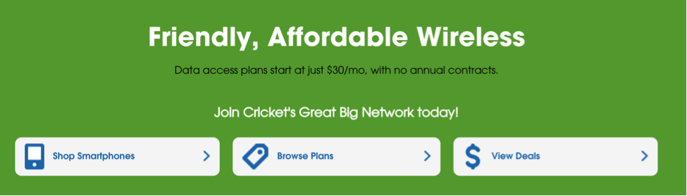
At Cricket, our brand is all about smiles: we’re friendly, casual, and transparent, and we’re there to advocate for the customer. It’s a brand voice that was easy to get on board with and easy to express in writing, especially when it comes to promo banners, entry pages, or campaign pages.


Marketing banners and pages (top of funnel or TOFU) have plenty of space to use taglines and implement personality, but how do we do that in shop flows (middle of funnel or MOFU) and account management (bottom of funnel or BOFU) experiences?
Again, we don’t have it all figured out, but we have found some small ways to put the fun in function. Here are a few examples from Cricket that fit our smart, straightforward, and friendly brand personality.
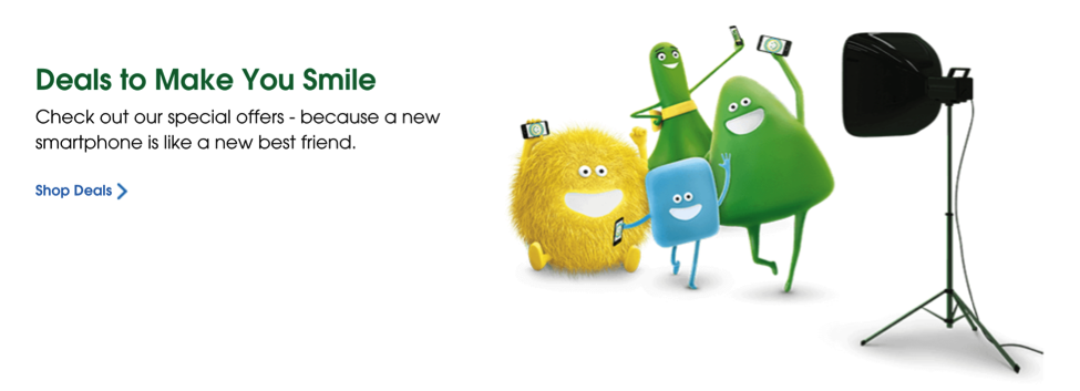
The below is the top of our “Bring Your Own Phone” page (BYOP). The primary goal of this page is to drive conversion; we do that by getting users to confirm their phone is compatible with our network. We start with a clear H1, and include a brand-approved tagline:

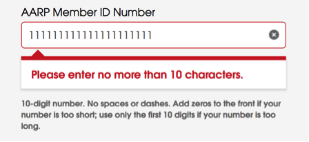
The user must enter their device ID number to confirm compatibility. If compatible, they’ll see a confirmation message that includes some personality (yay!) and some personalization (the make and model of the user’s phone):

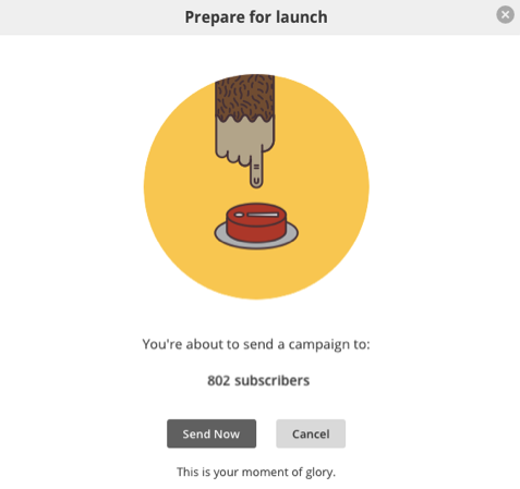
We use “Score!” when we’re tallying up how much a user is saving on the Cart page:

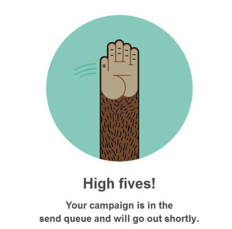
And of course, we want our new customers to “Smile Big” when they activate new service:

As we work to redesign and iterate on various parts of the Cricket website and app, we’ll be on the hunt for clever new ways to make the user experience more enjoyable through copy.
Other Brands I Admire
Now let’s look at some of the brands that I think do a fabulous job with this. These companies are getting it right: making the sale or getting me through the task at hand while making me smile along the way.
Modcloth
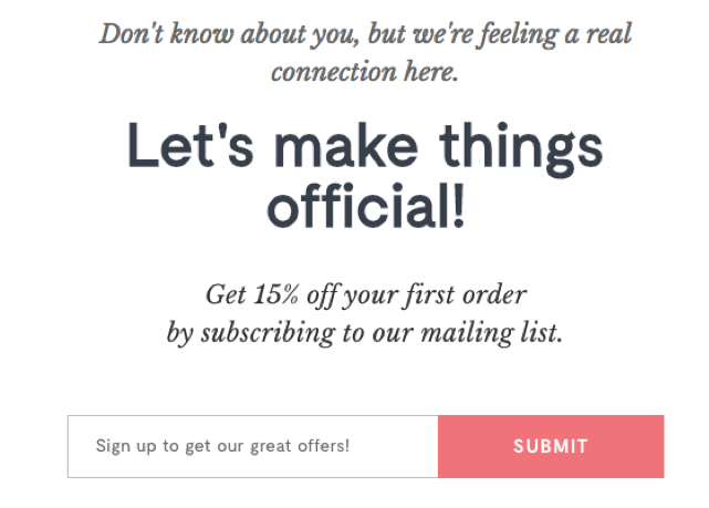
Not only do they have awesome product descriptions and adorable product names like the “Hope You Field the Same” dress and the “Set the Serene” bikini, but their email sign up matches their flirty personality:
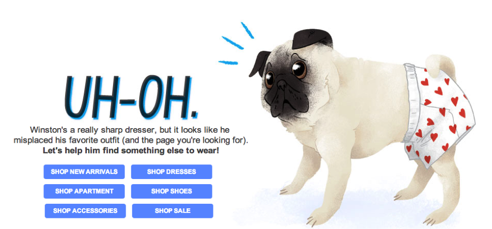
And their 404 page makes you giggle and gives you several options to get back to shopping:
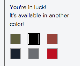
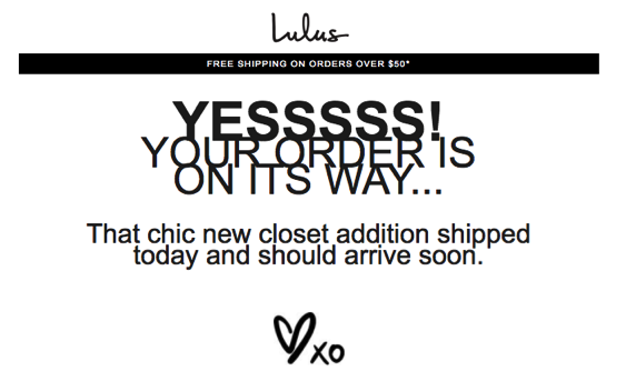
Lulus
This clothing brands’ color swatches have a positive spin to make you feel special:
They also use expressive email headlines:
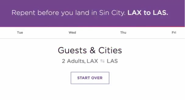
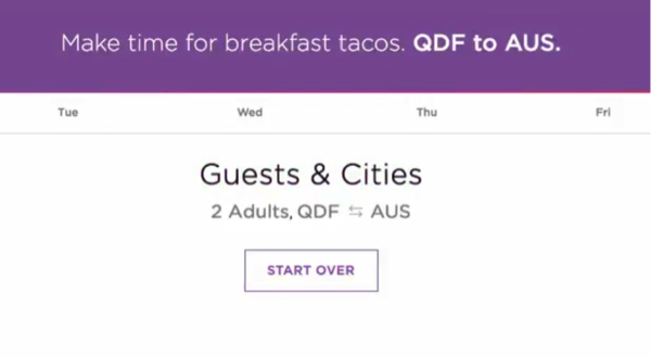
Virgin America
This article wouldn’t be complete without a nod to one of my coworkers, who showed me the amazing interactive copy that Virgin America was using a few years ago.
These hilarious messages show up when you search for a flight. As you’re waiting for the results to populate, you’re entertained with destination-specific content:

Mail Chimp
And last but definitely not least is Mail Chimp, whose content has been widely praised in the digital world for its casual tone, sense of humor, and originality.
When Should You Avoid the Fun?
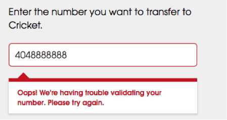
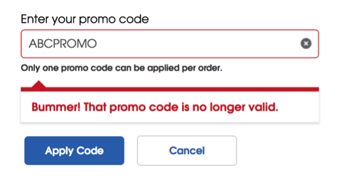
There are definitely some scenarios when we don’t want to be too playful or funny. Error messages and legal content are a good example.
Error Messages
When we’re delivering a somewhat negative message, we must consider how our user is feeling in that moment. If they’re attempting to complete a task and keep getting stuck, they’re likely feeling frustrated, so we want to treat them with respect and give them a straight answer. Honesty is the best policy here. Keep it simple.
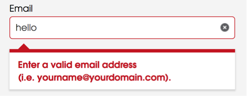
We do find, however sometimes casual words like “Oops!” or “Bummer!” can soften the blow when used lightly. Here are a few ways we’ve done that:
When Dealing With Legal Content
Explaining complicated business policies or complex promotional offers can be difficult. And required disclaimer text makes it tough to express personality.
My team and I know this struggle all too well. We’re often challenged to take something long and intricate and communicate it in a way that’s concise and clear. We sometimes use a pop-up modal so we can detail out the nuances.
If we’re lucky, we can insert some personality into the heading or intro copy. Here’s an example from our app using a casual “Heads up” to introduce the fact that our discount structure has changed:

At least we’re able to keep it simple while alerting the customer that they should read the info behind the link.
Conclusion
Putting the fun in functional content is a unique challenge for UX copywriters, but it’s also an opportunity to entertain and connect with users in an otherwise direct and straightforward world.
It can be a tricky line to walk, however, and sometimes there will be pushback from stakeholders who don’t see its value. Proving that it helps increase engagement or conversions can help. If your company has an A/B testing platform, run some tests on current copy vs. copy with a little more personality. My guess is you’ll find that the fun stuff performs better.
The Author

Jamie Hirthler Herring is an Atlanta-based writer and content strategist focused on bringing user-centered digital experiences to life. She is currently leading the award-winning Digital Content Strategy Team at Cricket Wireless in Atlanta, providing functional oversight and creating content strategies for the ecommerce side of cricketwireless.com. Before launching her creative career, she spent three years teaching English to adults in Costa Rica. She holds a Bachelor of Fine Arts in Ceramics from the University of Georgia.
What to Check Out Next
Events, Resources, + More

Workshop: Are You Ready for AI?
Is your organization really ready for AI at scale? Let the Content Science team guide your leaders through assessing 4 areas of readiness.

Course: Prompting Text Generative AI
Learn how to bring out the full potential of text generative AI to create impactful content from this on-demand course.

Webinar: Benchmarks for Content Effectiveness
It's not about more content. It's about more effective content. Gain tips based on Content Science's unique research + experience.
The Ultimate Guide to End-to-End Content
Discover why + how an end-to-end approach is critical in the age of AI with this comprehensive white paper.
Comments
We invite you to share your perspective in a constructive way. To comment, please sign in or register. Our moderating team will review all comments and may edit them for clarity. Our team also may delete comments that are off-topic or disrespectful. All postings become the property of
Content Science Review.